

Monthly Econ Review 1/22: Data Dashboard
Monthly Econ Review 1/22: Data Dashboard
Your own customized dashboard powered by Federal Reserve data

To set off this series, I’m going to be breaking down a very helpful and powerful tool I’ve created. The Federal Reserve’s Fred website allows you to create and save customized graphs and compile them into a dashboard which can then be shared if you have an account with them. I’ve decided to create a dashboard which I believe encompasses data on a number of key topics, including the overarching long-term health of our capitalist economy, the income going to capitalists, workers and rentiers, the labor market, business cycle/financial stress indicators, and the length of the working day/labor productivity.
I will be going through each of these graphs and how to read them, at the end of this blog will be a link to the dashboard.
The first graph is one I covered in my last post of 2021 on the secular rate of profit: the rate of profit for the United States whole economy, with the blue line being the annual data which goes back to 1929 and the red line being the quarterly which gets updated more regularly.
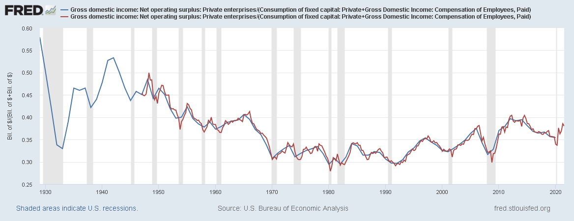
The general rate of profit is useful for two reasons, it can tell us a lot about where we are in the business cycle, with a rising rate of profit associated with early cycle and a falling rate of profit associated with late cycle; it can also tell us about the overall long term trend of the economy, with a secular decline in the rate of profit indicating higher wages and/or fixed capital investment.
We can also look at the rate of profit for the nonfinancial sector, which tells us a little more about what the profitability of the productive side of the economy is.
